


In my experience, very few developers know what happens after adding display: flex. If I asked how margin behavior changes 99% of developers don't answer.
So I created a live cheat sheet and wrote this article to fix this situation. I'm sure you will find some new things!
But before embarking on reading I leave the link on my Substack newsletter about CSS. You know what to make 😎
Let's go!
Default behavior
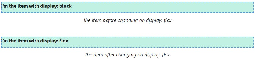
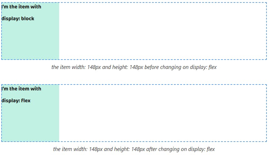
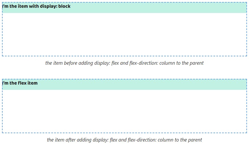
1. The the width property of elements with display: flex fills up all available space by the text direction. The height property is calculated automatically depending on the content height.
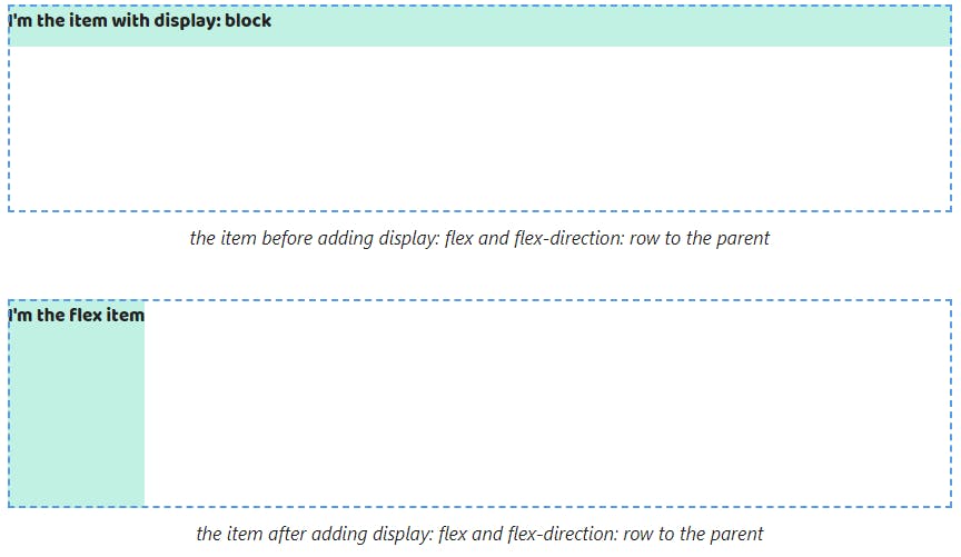
If the element has display: block by default we won't see any changes after changing the block value on flex.
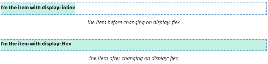
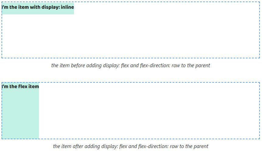
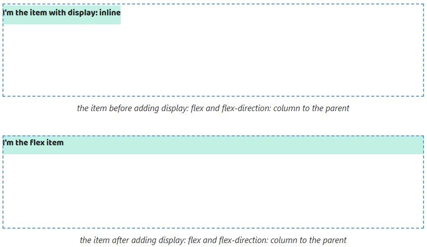
And they happen for elements with display: inline. The width property stops depending on the content after the inline value on flex.
If the content of elements with display: flex doesn't fit on one line then browsers will move it to a new line. The width property will equal the width property of the parent.
If we change the block value on flex then we won't see changes as with the width property.

And if we change the inline value to flex the width property stops depending on the maximum line length.

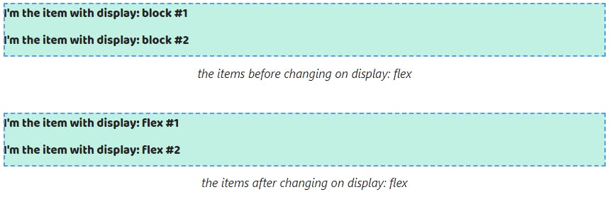
2. By default elements with display: flex are positioned in a column. So if we change the block value to flex elements will save its position.
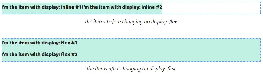
And if we change the inline value to flex we will get that they are positioned in a column.
Box model features
3. The width and height properties can be set to elements with display: flex. Therefore we don't notice changes when changing the block value to flex.
The width and height properties start to apply after changing the inline value to flex.

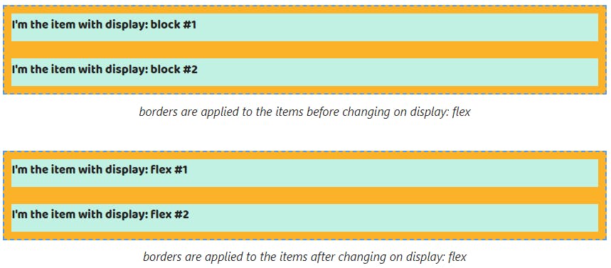
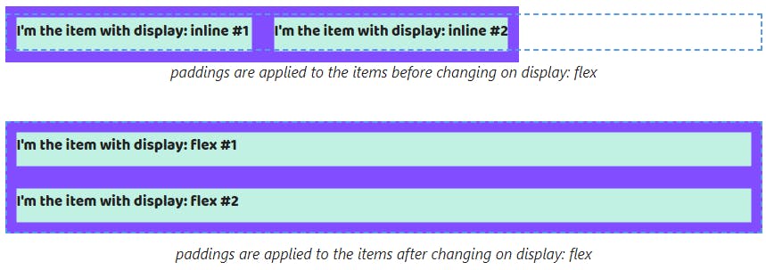
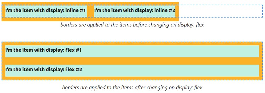
4. The padding and border properties can be set for elements with display: flex. If the element has display: block by default we won't see any changes after changing the block value on flex.

And we'll see them after changing the inline value to flex because vertical paddings and borders stop ending up outside the parent.
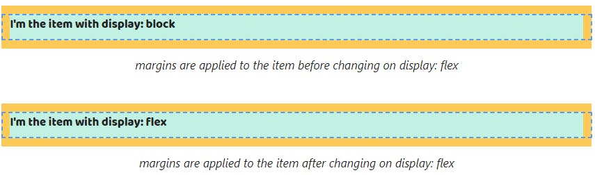
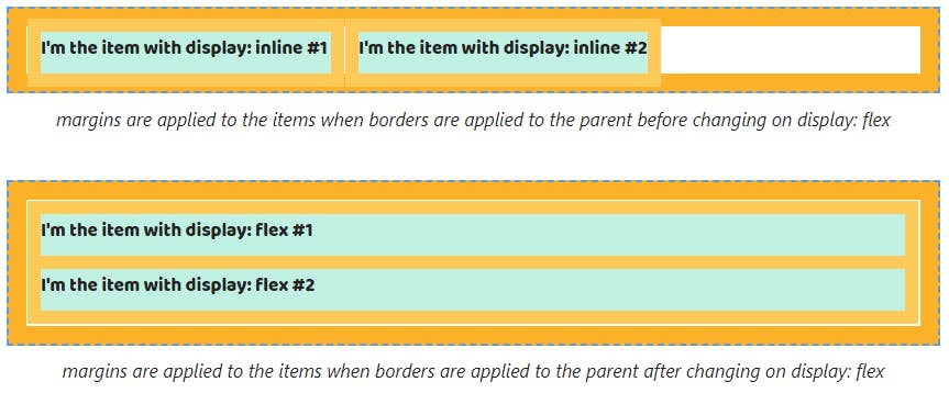
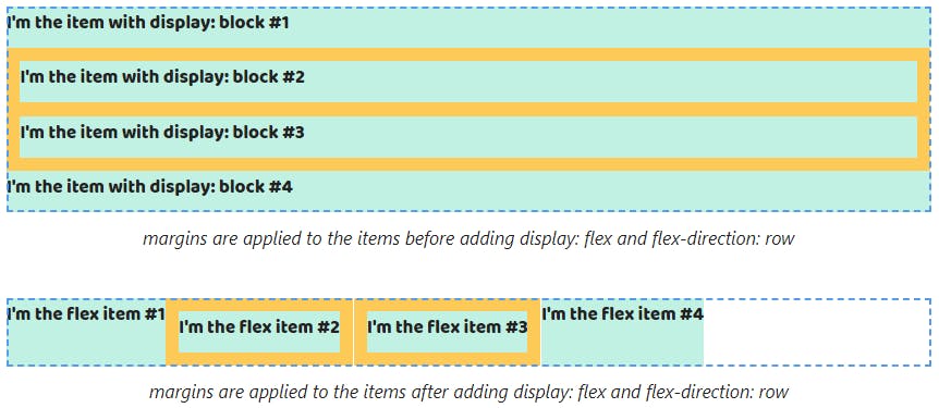
The margin property works with a few specificities. Since vertical margins of elements with display: block might end up outside the parent, this behavior saves after changing the block value to flex.
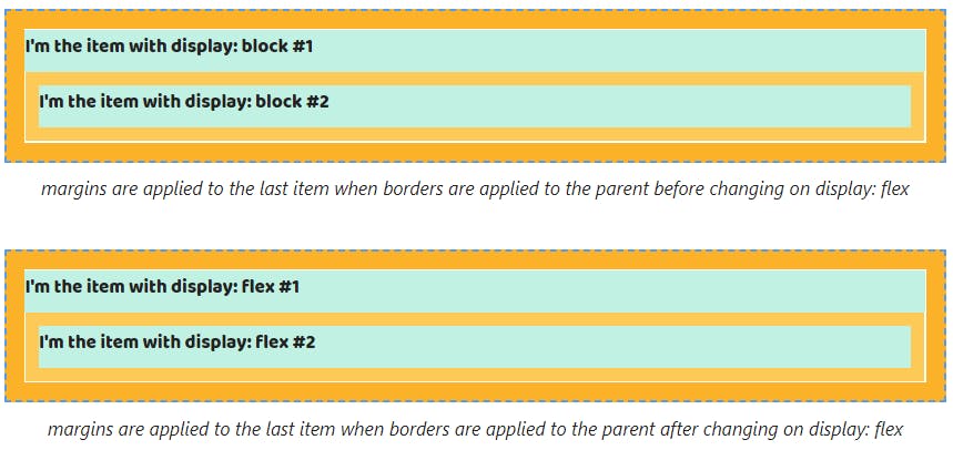
However, as with elements with display: block adding the border or padding properties to the parent stops this margins behavior.


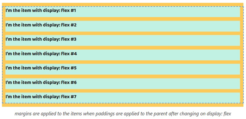
If the parent has a few elements with display: block top margins will end up outside it from the first element and the bottom from the last. Changing the block value to flex doesn't cancel that.


As with a single item case, adding the padding or border properties to the parent stops this behavior for elements with display: flex too.


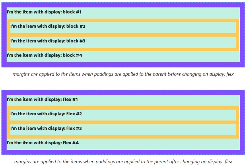
Also, margins between adjacent elements continue collapsing when changing the block value to flex Also. The gap between elements will equal the largest.

And collapsing is saved after adding the padding or border properties.

Since vertical margins of elements with display: inline might end up outside the parent, this behavior saves after changing the inline value to flex.
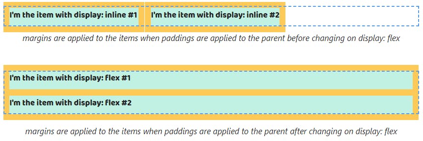
When changing the inline value to flex, margins don't overlap paddings or margins that are set to the parent.

When we change the inline to flex and the parent has multiline elements top margins will end up outside it for only the first element and bottom margins for the last.
Margins from other elements stop overlapping siblings by vertical. They will be collapsed.

Default behavior of flex items
Note! Flex items are childs of the element with display: flex or display: inline-flex
5. Flex items always are blockified. It means all block values are saved.

All inline values will be changed on block values. So the inline and inline-block values will be changed to block, inline-flex -> flex, inline-grid -> grid and inline-table -> table.

6. The width property of flex items depending on the flex-direction property. If flex-direction: row (default value) the width property is calculated automatically depending on the content and the height property of flex items is equal to the height property of the parent.
Thus the width property stops to be equal to the width property of the parent for elements with display: block. It's calculated depending on the content. The height property doesn't depend on the content and becomes to equal the height property of the parent.
In the case of elements with display: inline we will get the height property is equal to the height property of the parent.
When flex-direction: column the width property of flex items fills up all available space by the text direction and the height property is calculated automatically depending on the content.
As a result, this behavior is the same as the behavior of elements with display: block.
There are changes for elements with display: inline. The width property becomes to be equal to the width parent.
If the content of a flex item doesn't fit on one line then browsers will move it to a new line. The width property will equal the width property of the parent. It doesn't matter that a value is set to the flex-direction property.
As a result, the content of elements with display: block will be displayed the same after adding display: flex to its parent.

The width property of the element with display: inline stops to be calculated depending on the maximum line length.

7. By default flex items position on the same line. If there isn't space, browsers will squeeze them depending on its content.
For this reason elements with display: block stop positioning in a column.

The single change for elements with display: inline is they are squeezed.

Also, a position might be changed using the flex-direction property. If we set the column value flex items will be stacked and stop squeeze.
This behavior repeats for elements with display: block.

In the case of elements with display: inline they stop to be on the same line and will display in a column.

Box model features of flex items
8. The width and height properties can be set to flex items. It doesn't matter which the value is used for the flex-direction.
It's why we won't see some changes after becoming the element with display: block to a flex item.


When it comes to elements with display: inline we already can set the width and height properties after adding display: flex to the parent.


9. The padding and border properties can be set too. They will work without changes for elements with display: block.

When it comes to elements with display: inline vertical paddings and borders stop ending up outside the parent.

The padding and border properties for elements with display: block save their behavior when adding flex-direction: column to the parent.


Adding flex-direction: column doesn't affect the behavior of properties for elements with display: inline in comparison with flex-direction: row.

Pay attention vertical margins don't end up outside the parent. That behavior doesn't depend on the flex-direction property. If we set the row or column value we will get an equal result.
That leads to we'll see changes if we use elements with display: block.

Also, that applies to elements with display: inline.

If the parent has two elements with display: block margins stop ending up outside it from the first element and the bottom from the last.


In the case, we set margins for adjacent elements with display: block they stop collapsing.

P.S. 👉 Live cheat sheet about the display property
✉️ I love to help people learn more about HTML/CSS. If you have any questions, please, use my email for communication 👉 melnik909@ya.ru. It's free
💪 Discover more free things from me